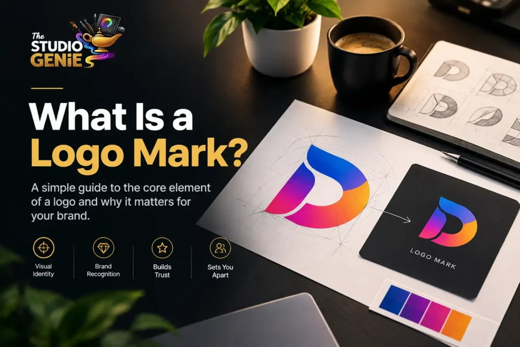
A logo mark is the graphic symbol or visual icon that represents a brand without using the company name. It is also called a logomark, brand mark, or pictorial mark, consists only of a graphic element. The design may use a simple icon, an abstract shape, or a custom symbol that customers associate with a business over time. Unlike text-based logos, a logo mark communicates through visual recognition rather than words.
Well-known examples include Apple’s apple symbol, Nike’s swoosh, Target’s bullseye, and Shell’s shell icon. Each graphic symbol represents the brand even when the company name does not appear beside the design.
A successful logo mark remains simple, memorable, and versatile. Every logo mark should work consistently across digital and print materials, from a 16-pixel favicon to large vehicle wraps and outdoor signage measuring 4 feet (1.2 metres) or more.
Why Is a Logo Mark Important?
A logo mark creates instant visual recognition and strengthens your brand identity across every marketing channel.
People usually remember images faster than text. A distinctive graphic symbol helps customers identify your business on websites, product packaging, social media profiles, advertising materials, and mobile applications.
A professionally designed logo mark offers several advantages:
- Builds stronger brand recognition through consistent visual identity.
- Fits small spaces such as favicons, app icons, and profile images.
- Works across print and digital platforms without losing clarity.
- Supports long-term brand growth through consistent visual branding.
- Makes your business easier to recognize in competitive markets.
Many businesses begin with a combination mark that includes both a logo mark and a wordmark. As brand recognition increases, the graphic symbol often becomes recognizable enough to stand on its own.
What Makes an Effective Logo Mark?
An effective logo mark is simple, distinctive, scalable, and relevant to the brand.
Every successful logo design shares several characteristics regardless of industry. The objective is not artistic complexity but immediate recognition.
A strong logo mark should include:
- Simple shapes that remain clear at every size.
- Unique visual elements that separate the brand from competitors.
- Balanced proportions that support consistent scaling.
- Clean lines that reproduce well in monochrome and colour.
- Timeless design choices instead of short-lived trends.
- Flexibility across websites, packaging, signage, merchandise, and digital media.
Professional designers usually create vector source files in AI, EPS, and SVG formats alongside raster exports such as PNG and JPG. Vector files preserve quality at every size, while raster files support everyday digital use.
A complete logo design package should also include brand guidelines that define minimum sizes, clear space requirements, colour specifications, and approved logo variations. These standards help every version of the logo remain consistent regardless of where the brand appears.
Comparison of Popular Logo Types
| Logo Type | Main Element | Best For | Examples |
| Logo Mark | Graphic symbol only | Established brands with strong recognition | Apple, Nike, Target |
| Logotype | Custom-designed brand name | Businesses with memorable names | Coca-Cola, Disney |
| Wordmark | Stylized text only | Clear brand name recognition | Google, FedEx, Visa |
| Lettermark | Initials or monogram | Long business names | IBM, NASA, CNN |
| Combination Mark | Symbol plus text | New and growing businesses | Adidas, Burger King, Spotify |
| Emblem | Text inside a badge or crest | Heritage, education, sports, government | Starbucks, Harley-Davidson, BMW |
Which Logo Type Should Your Brand Use?
The best logo type depends on three factors: brand recognition, business name, and where the logo will appear.
Ask these three questions before choosing your logo style.
How Recognised Is the Brand?
Established brands often rely on a logo mark because customers already recognize the graphic symbol. New businesses usually achieve better results with a combination mark that teaches customers to connect the symbol with the company name.
How Long Is the Brand Name?
Short business names often suit wordmarks or logotypes. Longer names usually benefit from lettermarks or combination marks because those formats improve readability without reducing brand recognition.
Where Will the Logo Appear?
Digital platforms require flexible branding. A logo should remain clear on favicons, app icons, websites, packaging, business cards, and large signage. A professionally designed logo system includes versions that perform well in every environment.
Best Practices for Creating a Strong Logo Mark
A strong logo mark combines simplicity, versatility, and originality while reflecting your brand identity.
An effective logo mark does much more than look attractive. Every design decision should support recognition, usability, and long-term consistency. A carefully planned symbol helps customers identify your business across every touchpoint without confusion.
Follow these best practices when creating a logo mark. Understanding how professional logo designers approach research, concept development, and refinement helps ensure every stage supports a consistent brand identity.
Keep the Design Simple
Simple designs remain easier to recognize and remember. Unnecessary details often disappear at small sizes, reducing clarity on mobile screens, favicons, and promotional products.
Focus on clean shapes, balanced proportions, and a clear visual concept instead of decorative elements.
Design for Every Size
Your logo mark should remain readable whether it appears on a website header, social media profile, product packaging, or a billboard.
Test the design in multiple sizes before finalizing the logo. A professional logo should maintain sharp edges and recognizable shapes without losing detail.
Choose Timeless Design Elements
Design trends change quickly, but your brand identity should remain consistent for years. Timeless colours, balanced geometry, and clear typography reduce the need for frequent redesigns and help build lasting recognition.
Ensure Versatility
A logo mark should perform equally well across different backgrounds and printing methods.
Create multiple approved versions, including:
- Full-colour version
- Black version
- White version
- Monochrome version
These variations ensure consistent reproduction regardless of printing limitations or digital display requirements.
Make the Symbol Unique
Generic icons rarely build strong brand recognition. Your logo mark should represent your business with distinctive shapes or custom graphic elements that customers can easily associate with your products or services.
A unique symbol also reduces the risk of resembling competitors within your industry.
What Should a Professional Logo Design Package Include?
A professional logo design package includes every file and guideline needed for consistent brand use.
Many businesses only receive a PNG file after purchasing a logo. That file works for basic online use but does not support professional branding across every medium.
A complete logo design package should include:
- Full combination mark
- Logo mark by itself
- Wordmark by itself
- Vector source files (AI, EPS, SVG)
- Raster exports (PNG, JPG)
- Monochrome versions
- Brand guidelines
- Clear space specifications
- Minimum size requirements
- Colour palette and typography details
These assets allow your business to maintain visual consistency across websites, signage, packaging, marketing materials, uniforms, presentations, and digital advertising.
Professional brand guidelines eliminate uncertainty by explaining which logo version fits each application.
Common Mistakes to Avoid
Avoiding common design mistakes improves brand recognition and protects long-term usability.
Many businesses weaken their visual identity because the logo prioritizes appearance over functionality.
Common mistakes include:
- Choosing overly complex illustrations.
- Copying popular logo trends instead of creating original designs.
- Using low-resolution files instead of vector formats.
- Ignoring scalability during the design process.
- Using inconsistent colours across marketing materials.
- Stretching, rotating, or modifying the approved logo.
- Skipping brand guidelines after the logo launch.
Correcting these issues later often requires a complete rebrand, which costs significantly more than investing in professional logo design from the start.
Conclusion
A logo mark is more than a graphic symbol. A well-designed logo mark becomes the visual foundation of your brand identity and helps customers recognize your business across every platform.
Understanding the differences between a logo mark, wordmark, logotype, lettermark, combination mark, and emblem allows you to choose a logo system that supports both current marketing needs and future growth.
Before choosing a designer, reviewing clients feedback can provide valuable insight into the quality of work, communication, and overall experience.
At The Studio Genie, we create strategic logo systems that combine creativity with practical branding. Every project includes scalable design assets, professional vector files, and clear brand guidelines so your visual identity remains consistent wherever your business appears.
Frequently Asked Questions
Can you give me an example of a logo mark?
Yes. Apple’s apple, Nike’s swoosh, Target’s bullseye, and Shell’s shell symbol are classic logo marks. Each design represents the brand without displaying the company name, making recognition possible through the graphic symbol alone.
How much does BrandMark cost?
BrandMark pricing depends on the package you choose. BrandMark offers several logo creation and branding plans, with costs varying based on design assets, brand kits, and licensing options. Check the official BrandMark website for current pricing before purchasing.
What is the difference between a logo and a logomark?
A logo is the complete visual identity, while a logomark is only the graphic symbol. A logo may combine text and imagery, whereas a logomark contains no words and relies entirely on visual recognition to represent the brand.
Is logomark one word or two?
Logomark is commonly written as one word, although “logo mark” also appears in many publications. Both forms describe the same graphic symbol that represents a brand without text, and search engines recognize either spelling as the same concept.